A charming conversation between you, a computer, and me
Prelude
Pirijan Ketheswaran is a designer, engineer, illustrator, and (sometimes) artist. He is trained as a biologist, but nowadays he works as the co-founder and interface creator of Glitch, a friendly community of creative app-builders.
Conversation
A charming conversation between you, a computer, and me
For TCI x Are.na's Library of Practical and Conceptual Resources, Pirijan Ketheswaran reminds us how user interfaces can be designed to be intimate, collaborative, and creative.
Recently, I got invited to—and trashed at—a wine festival. It was, of course, Instagram bougie. But also maybe profound.

We talked to winemakers and importers at their booths, they drank with us, and between pours they told us about how they made their wines, what each wine paired best with, and which grapes they were most proud of. We asked them what their home countries were like, how they got into wine, and did they like swimming? If they could only drink one or the other, would they go with wine or coffee? It all got a bit blurry.
To be honest, I remember the people more than I remember the wine. But it got me thinking about how all memorable conversations have a few things in common:
- You feel like your input and creativity are valued
- It’s more than transactional: informal chats can still be fun and sincere
- It isn’t just “professional,” but rather intimate and vulnerable as well
- The overall feeling behind the conversation matters more than its specific content
Conversations come in many forms, the least considered of which are our interactions with software. People tap and click Graphical User Interfaces to share their feelings, get things done, express their creativity, or just to kill time—many of the same things that might happen in a conversation between actual people. So what if instead of designing user interfaces to be merely transactional or professional, we designed them with the qualities of memorable conversations in mind?
As interface makers, we have a status-quo design for most things. It’s easy to hit that benchmark. But we can go further and aspire to build things that connect people with each other in more unique and meaningful ways.
For example, here’s a website for buying wine:

It’s easy to use, and it puts the content first. It’s… there.
While I still don’t know much about wine, I learned that every great wine has a story to tell. And, there’s a person behind each bottle. Winemakers spend a lot of time thinking about the design of their bottles because they want to stand out by expressing something unique about themselves.
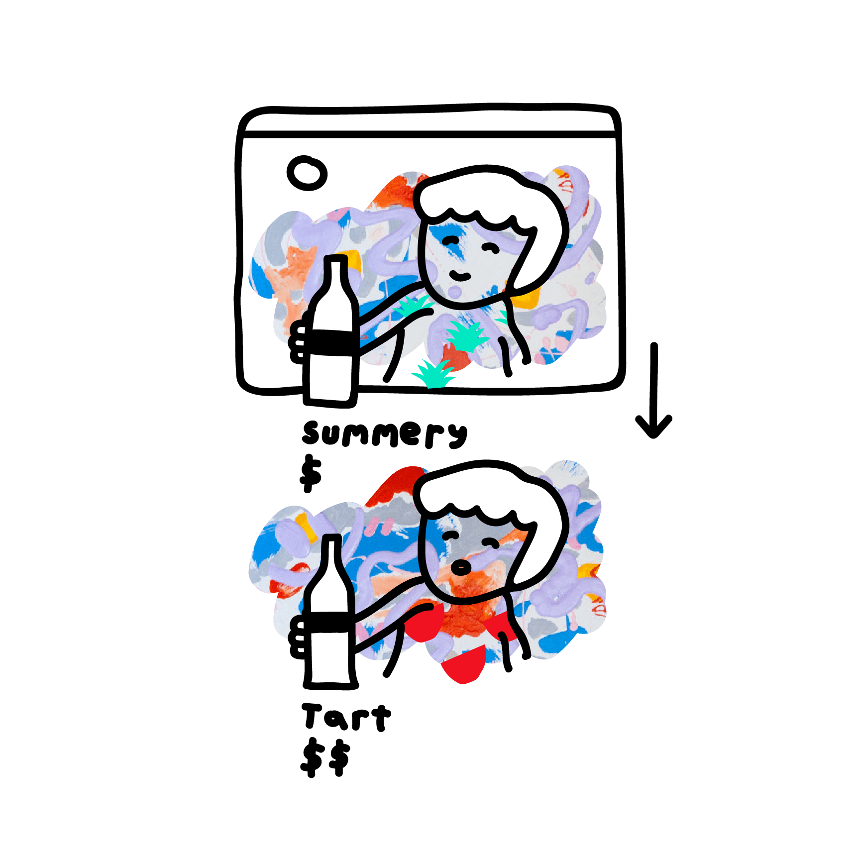
Let’s be like winemakers and make a website for buying wine that makes you feel something:

A meaningful conversation IRL is not just you telling me what you want, or me telling you how I feel. Conversations are creative and collaborative. You should feel like your input matters and that you’re more than just a consumer being sold a product or idea.
As software designers, we can use the interactivity of our medium to mirror the qualities of a good conversation. For example, we could add a small yet creative stamp-maker to our wine website, so that visitors can add their own personality and flair to a bottle’s label.

Maybe this approach to making interfaces is a little different, a little weird, or extra work. But as we continue to define this new web-based medium, we’re standing on the shoulders of the many creative tools that took this conversational spirit to heart.
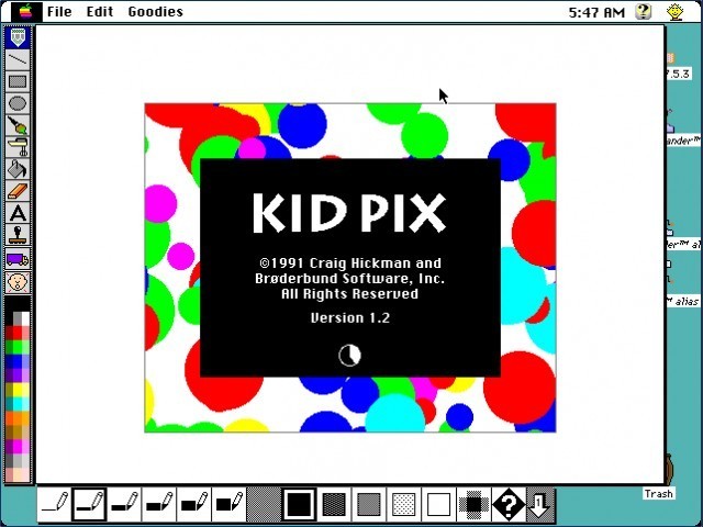
For some inspiration, you can look at drawing tools for kids (and the young at heart):
Music synthesizers:
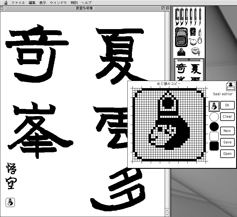
And this calligraphy app from the ’90s (probably) with an integrated stamp editor:
You can find more great shoulders to leap from, and maybe cry on, while you make your own memorable interfaces at the Are.na channel I’ve made for the Library of Practical and Conceptual Resources, called “A charming conversation between you, a computer, and me”.
- Name
- Pirijan Ketheswaran
- Vocation
- Software designer

Some Things
Pagination


