On thinking really big
Prelude
Kent Twitchell is an American visual artist known for multi-storied exterior murals he calls “Monuments to American Cultural Heroes.” After serving as an Air Force artist at Headquarters 3rd AF in London he moved to Los Angeles to study art under the G.I. Bill, receiving his MFA in 1977 from Otis College of Art & Design. He has taught at several Southern California colleges and is presently MFA mentor at Laguna College of Art & Design and art department advisor at Biola University. He was cofounder of the Mural Conservancy of Los Angeles. Twitchell has received three Honorary Doctorates and is often referred to as the Godfather of Street Art. Currently he is designing mural monuments to Charles White, Edward James Olmos, and Martha Alf. He now works with his son, Art Twitchell, at their studio in Long Beach, California. A five-part video documentary is being produced by Alice Emmons and Eric Swenson covering Twitchell’s art over the last 50 years.
Conversation
On thinking really big
Artist Kent Twitchell discusses what led him to making large-scale public works of art, the specific challenges of being a muralist, and how he makes such realistic portraits.
As told to Nate Rogers, 2976 words.
Tags: Art, Beginnings, Process, Adversity, Independence, Production.
What drew you to L.A.? How did you go from growing up on a farm in Michigan to being compelled to live in such a massive, messy city?
Up through the ’50s, even into the ’60s, [California] was an ideal place. It was just a place where creative people from all over the world would go, because you often didn’t get any support where you’re from, wherever it was, or people would make fun of you. L.A. was the place you could go, hide out, try things out, and fail 10 or 15 times in a row. All you had to do is finally succeed and everybody would stand up and applaud you. You didn’t get what they call a “rep.” Back east you could get a rep, and once you got it you could never live it down; you were dead.
Is there anything about L.A. that stands out to you as being beneficial for murals specifically? I’m curious if you think the city has a certain quality to it that makes it more conducive to your type of work.
I came out here primarily because my uncle lived here and I decided to go to the school on the G.I. Bill here. The hippie [movement] had just erupted, and youth culture went from the uptight ’50s, where you had your hair perfect and your shoes shined, to being free to have your hair all messed up—even not shave. That was really neat. People were painting all over everywhere. I got a VW Bus; I painted on the side of that back in the ’60s, and I was painting on fences, just trying to make life more beautiful. That was naive. I have always been a realist at heart so I decided to do something on a building that was more personal, which is realism. I decided to paint Steve McQueen—nothing can be more L.A. than McQueen. Realism in art was not at all cool, especially figurative realism. And yet, all of a sudden that mural just exploded all over the world; it was in newspapers, magazines, and TV. I was being called literally from all over the world for interviews.
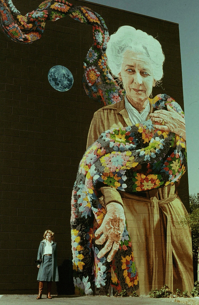
The Freeway Lady, photo by Kent Twitchell
When you started doing murals of that size, how did you figure out exactly the best way to go about creating them, considering that you had never done them before? Were you figuring it out on the fly, or did someone teach you?
No, nobody was teaching me. I had painted signs in the ’50s, so as a teenager I’d always planned everything out. When I would letter trucks, which was the easiest way to make money, I wouldn’t start from scratch on each side—I would carefully do a pattern on white butcher paper. Then I would go over all my lines with a pounce wheel, creating tiny holes, allowing me to pounce white chalk from a bag through the holes. I could use the same pattern as many times as needed. Then I would paint the letters.
That’s the way I handled something that was huge—I just figured it all out mathematically based on how tall it was. I drew everything out carefully on butcher paper, making all my mistakes and erasing them before going up on the wall. When the drawing was exactly what I wanted, I turned it over on a big window and traced around the lines with graphite, creating a kind of carbon paper. That way I could transfer it to the wall by going over all my lines with a ballpoint Fisher Space Pen, which was an old commercial art technique. These pens work on a wall because they are pressure-fed, not gravity-fed. I primed the wall with white acrylic gesso, transferred my drawing, and painted gloss medium over the top before painting the mural.
Has your process changed at all over time? Does it change based on the size of the project or does it mostly just change as you fine-tune the materials and figure out how to execute a piece most efficiently?
I began to realize that if you want to blow something up big, you grid it out. My grids were usually three feet high by four feet wide. I just drew the entire thing until I got it perfect. Then I gridded it out so each grid would end up representing three feet by four feet. Then I photographed each of the grids. After McQueen, I started getting into black and white photography. I set up my own darkroom and I would photograph each of the grids with Kodak Panatomic-X and I developed them myself. Then I would put them in a slide projector, and I would project each grid, three feet by four feet, onto butcher paper. The whole process took time. But when I put that groom up there [in “Bride and Groom,” which was finished in 1976], he was all over the world because no one had ever seen anything that big, that real before. It just was ridiculous.
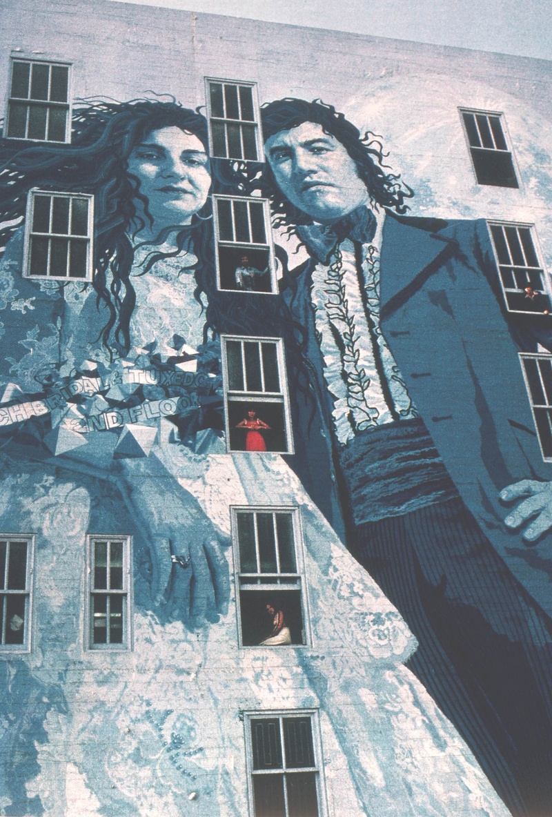
Bride and Groom, photo by John Malmin, courtesy of Kent Twitchell
When you were conceptualizing “Bride and Groom,” did you go downtown and use the space itself to help create it in your brain? Or did you come up with something and then work to fit it into the space?
The wall comes first. You don’t dare think of anything until you see that wall. You really get to know the wall—that way I was able to have that row of windows between them. [Kahlil] Gibran said, “Let there be spaces in your togetherness.” I don’t know if it’s even visible anymore, but I had a giant blue moon behind the groom’s shoulder.
Oh, really? “The Freeway Lady” has a moon, too.
Yeah. But [behind the groom it’s] just a humongous, giant moon with, I think, a window in the middle of it. I love doing things when there’s windows. It just makes it so much more magical.
I’m interested in the murals that you’ve done on freeways. There’s something almost funny about that setting because it maximizes viewership while also minimizing time that people can spend looking. It’s not like a gallery; people are moving quickly but they do see the mural, and over time they can process the whole thing.
That’s exactly right. Any of the freeway murals I’ve ever done, I’ve always considered that and made it very detailed so that there’s a lot to see, but my image could also, hopefully, be appreciated fully at a glance, too. Both of those things had to happen. In other words, hundreds of thousands of people would be driving by every day and I wanted there to be enough information there so that they could see something new every few days. But the overall image, the overall content, would get them the first time they saw it. Sometimes murals can be way too [complex] on the freeways. It’s just not the right place for it.
I can’t think of many other artists who have worked in as inhospitable a location as a freeway, too. Is it intense climbing up the side of a freeway wall and trying to do something artistic?
Very. The first freeway I ever did was was [“The Freeway Lady”] in 1974. It was extremely inhospitable: The building itself was practically the freeway wall. It didn’t affect me much at first. I was transferring her on the wall with the butcher paper like I do, but after I had her about half painted my brain was changing. I was actually becoming hostile and I was imagining pushing a button and making [the trucks] blow up! I thought, “Whoa, where does that come from? That’s not me.”
I realized it was the noise. The noise was actually torture. I learned later that the people that work in the freeways, they’ll wear ear plugs. It never occurred to me to wear ear plugs. Duh! It’s not my favorite environment. I doubt that I would ever look for a freeway wall again. It was something that I did at a particular time and those days are probably gone.
Something I’ve thought about in relation to your work is the nature of your subjects. The “L.A. Chamber Orchestra” mural, for example—I used to see that one all the time as a kid, when my dad would be shuttling me around town, and I was always fascinated by it. In my head I assumed that they were the biggest celebrities in town or something. It was only when I got older that I realized the Chamber Orchestra isn’t really famous outside of the classical music world. It’s this interesting phenomenon: When you present someone on that scale, they become famous, and everyone in town knows them, even if they don’t really have any familiarity with their lives or work.
Well, the L.A. Chamber Orchestra is arguably one of the greatest groups of musicians in the world, highly respected by other classical musicians. It was a fantasy job to be able to paint them. They let me go to the concerts for free—I would sit there and just make notations of who I wanted to paint. I took photograph after photograph of an ensemble for the far left wall with [violinist] Julie Gigante front-center. I didn’t know her name was Gigante at the time. I was unhappy with the grouping, so I decided I’d paint Julie [alone] up there, and I’d just have a lone figure [of the concertmaster Ralph Morrison] on the right. I did plan to paint many more musicians behind him but it just never happened. There’s been talk subsequently for me to go up and paint those additional musicians. That may or may not happen, but hopefully it will. I’d love to do it.
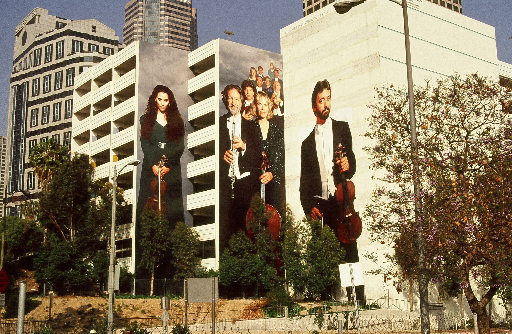
Harbor Freeway Overture, photo by Kent Twitchell
So when do you consider a mural to be completely finished? It seems like in a lot of instances with art, when it’s done, it’s done. But with something like street art or outdoor work that’s part of the city, there’s an argument to be made that it keeps adapting; if it gets dirty, or if somebody tags it, or if a tree grows in front of it, it becomes a part of the work in its own way. Do you accept the belief that the mural can be continuously updated?
Sometimes it depends on if it continues looking right in a changing environment. If an adjustment would improve it and you have the budget and the time, then go ahead, make the whole thing work as a singular aesthetic again as it once did. I’ve done that.
I know you’ve spoken with a degree of frustration over graffiti culture and any public art that doesn’t have permission. It made me wonder what you think about highbrow graffiti artists, like Banksy. Do you feel strongly about permission being the defining moral characteristic of street art in all cases?
I really believe that you should give people respect. If I were to do something that was the best painting I’ve ever done on somebody’s wall without permission, I would be disrespecting them. I don’t care how good I may think I am—I don’t have the right to do that. I think what we’ve done in this postmodernist mentality that we’ve found ourselves trapped in is to fear saying anything is right or wrong. I’m not afraid of that. It’s like the person who says, “There are no absolutes,” and the other person says, “Are you absolutely sure?” Postmodernism dies internally. There’s no criteria anymore.
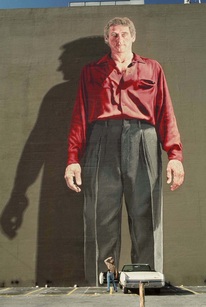
Ed Ruscha Monument, photo by Melba Levick
I was thinking about it: When street art started becoming a thing in the early ’70s, that’s probably around the time graffiti expanded too, right? It almost seems like the street-art movement might have accidentally created graffiti culture; people saw murals and they got the idea to do it themselves.
I don’t generally use the term “graffiti”—I usually say “spray-paint vandalism.” I want to sew that context to what they’re doing because it’s just vandalism unless you’ve gotten permission. We’ve devolved into a culture where it’s cooler not to be virtuous. I think we can see in the streets of San Francisco, Seattle, Los Angeles, and many once-beautiful large cities that virtue shouldn’t have been kicked out quite so soon. You’re right. Once we started doing things on the walls that were beautiful, slowly but surely the spray-paint people would put things first near it but not over it. Eventually, over time, spray paint was used to actually destroy.
Did the interest or concern with what’s right and what’s wrong power the mindset that’s led you to formally defend your painted-out murals in court [on two separate occasions]?
The first one was “The Freeway Lady.” And I had no interest whatsoever in pursuing anything, but the Mural Conservancy of Los Angeles brought me on as one of the founding board members, and an attorney by the name of Amy Nieman was also one of the founding members. She kept at me. She wanted me to pursue it because it was just wrong. That same person who had it painted out gave me permission to do [the mural]. And he could have written me. For one thing, it’s illegal for there to be a billboard there anyway, because it’s too close to the freeway. [Secondly,] he never checked in—all he did was have the piece painted out on an early Sunday morning, so that nobody would notice it, which was unheard of, and then an ad that said, “Your ad here,” and his phone number.
[Amy] kept at me and at me and still I didn’t want to do it, and she finally said to me, “Kent, we’re not saying people don’t have the right to paint out their own property—they just have to be polite about it!” She said that’s what laws are. Laws are forcing people to be polite. It forces people to act civilized even though they don’t feel civilized, which consequently ends up with a civilized society. We have a national and a state law, both of which he broke, that say, “Yes, that’s your wall and you can keep it, but you just need to give the artist notification, and give him three months to remove it.” It went to arbitration, and the judge said this is open and shut.
Related to this conversation of standing up for yourself in court, and defining what’s right and what’s wrong: The majority of your mural subjects have a stoic expression that have a feeling of judgment, you might say. You’ve referred to it as laying a guilt trip on the people below.
I don’t remember ever saying that, though I’ve had people say that to me. For instance, “The Freeway Lady”—you’d see it everyday, and sometimes it depended on the lighting or the clouds or [whatever]… I didn’t understand how that happened to be until one day I decided to look at a close-up of her face—you know, I had a study. I put my hand over the right side of her face and then the left. One side of her face was loving, and the other side was judgmental. I remember now when I recognized that: When I photographed [the actress Lillian Bronson, who served as the mural’s subject] in her backyard in Hollywood, I knew she was in Spencer’s Mountain and that she was in a lot of things, but when she came to her door I thought she looked too young—I decided to just photograph her anyway, to be polite.
But when she got behind the lens, she turned into an older woman. I’ve never seen anything like that, she was just such a pro. And then all of a sudden I recognized her in my viewfinder, and I started shaking. And she says, “What’s wrong, dear?” And I said, “You’re that scary judge in Perry Mason!” And she smiled and said, “Yes,” and I said, “I’m so glad I chose you.” That was, I guess, why she was such a good judge, because one of her eyes was judgmental and the other was unconditional love. And so it really depended on the lighting and everything what caused people to see when they saw her face. One person wrote a big article in the newspaper that she was terrifying [laughs].
Seeing it on a college campus [where the mural was recreated in 2016] is one thing, but I would imagine seeing it on your way to work every day is a different story.
Also, I took a lot of photographs of [Bronson], and I used completely different photographs for the new mural. I think that judgmental element is gone now, because I made sure that both eyes were very loving.
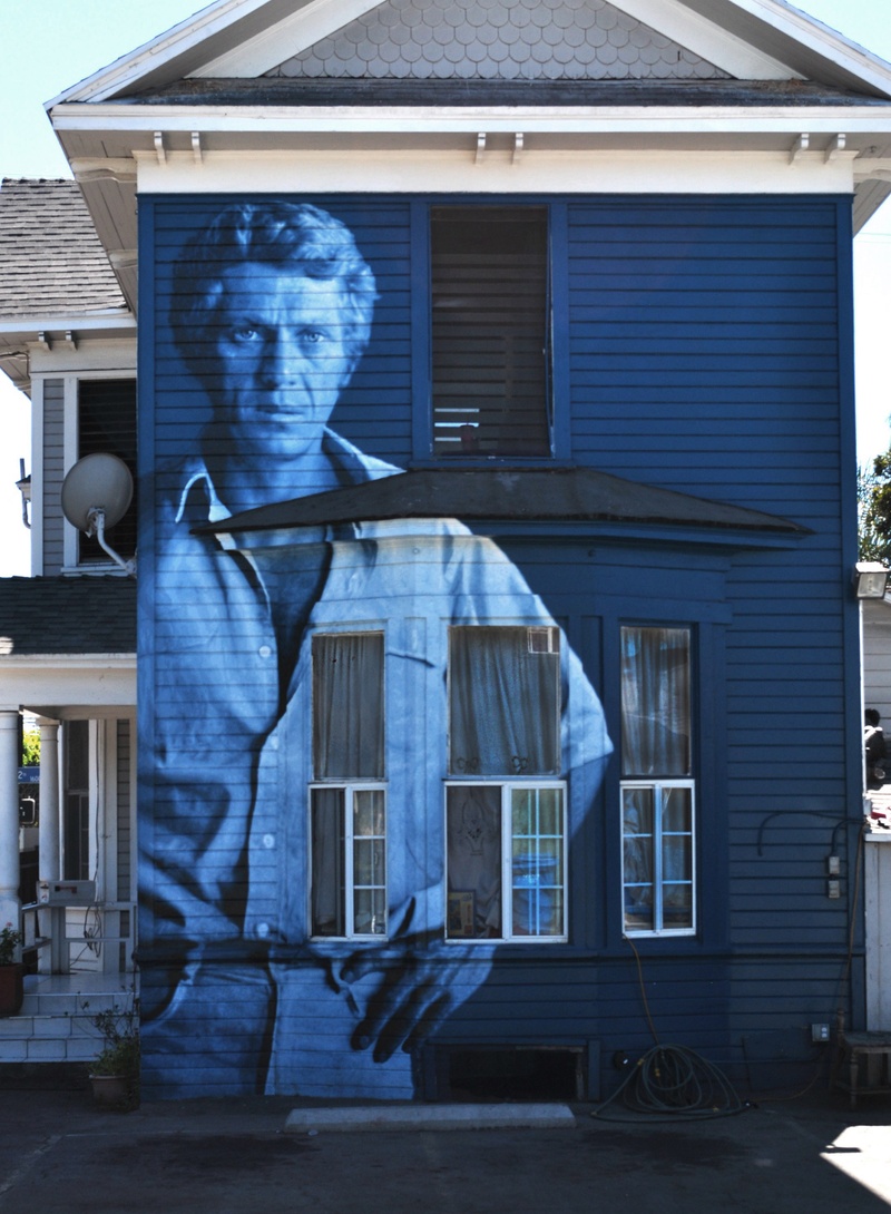
Steve McQueen Monument, photo by Gil Ortiz
Kent Twitchell Recommends:
Norton Simon Art Museum, in Pasadena
The Huntington Library, Art Museum, and Botanical Gardens, in San Marino
Abalone Cove, below the cliffs in Rancho Palos Verdes
The L.A. Chamber Orchestra, at the Alex Theater in Glendale
The Gamble House, in Pasadena
- Name
- Kent Twitchell
- Vocation
- Artist
Some Things
Pagination
